
6 min read
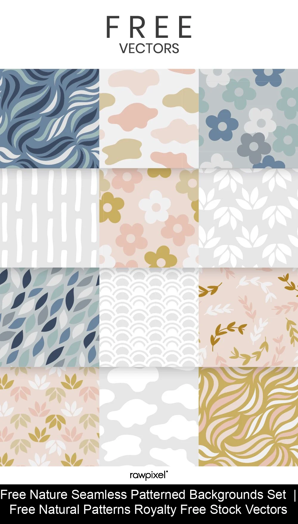
A seamless background pattern is a small image, called a tile, whose edges match so that repeating it side by side shows no visible joins. On the web, CSS repeats the tile automatically, so a small file can cover a whole page. Good patterns stay quiet enough to keep text readable.
In this guide
What Is a Seamless (Tileable) Background Pattern?
A seamless pattern, also called a tileable background, is a tile designed so that its left edge continues into its right edge and its top edge into its bottom edge. Place copies next to each other and the eye reads one continuous surface instead of a grid of squares.
The idea comes from tessellation, which Wikipedia defines as the covering of a surface using one or more geometric shapes, called tiles, with no overlaps and no gaps. Designers have used the same logic for centuries in wallpaper, textiles and ceramics. If you want the wider context, read about decorative art through the centuries.
Where Does Pattern Design Come From?
Web patterns inherit their rules from printed ornament, where repeat design was codified long before screens. Owen Jones published The Grammar of Ornament in London in 1856 with the publisher Day and Son, a catalogue of ornament drawn from many cultures. Jones also designed wallpaper himself, for firms including Townsend and Parker, Trumble & Sons and Jeffrey & Co.
His emphasis on flat patterning and geometry is the same discipline you apply to a tile: a motif has to repeat across a fixed unit without announcing the join. Block-printed wallpaper made that unit physical, because the wooden block was the tile. A web tile is the same idea measured in pixels instead of inches.
What Types of Patterns Work Best?
The patterns that work best are those with an even texture and low contrast between their own colors, because they repeat without drawing attention to the repetition. Match the type to the job:
| Type | Visual character | Main risk | Best use |
|---|---|---|---|
| Geometric | Orderly, modern | Visible grid if the motif is large | Headers, app backgrounds |
| Floral | Soft, decorative | Busy detail behind text | Wide margins, invitations |
| Paper or wood texture | Warm, tactile | Looks muddy when scaled | Page backdrops, cards |
| Lines and stripes | Rhythmic, light | Moiré on some screens | Section dividers |
| Monochrome | Calm, neutral | Can feel flat | Behind long reading text |
Pick colors with intent: how color shapes mood applies to a background as much as to a painting. For paper, canvas or fabric looks, study textures in mixed media and photograph or scan your own surfaces.
Value matters more than hue here. Two colors with different hues but the same lightness, such as a sage green and a gray-pink, read as a calm surface. Two colors with the same hue but very different lightness read as stripes, even when you intended a texture.
How Do You Make a Pattern Seamless?
You make a pattern seamless by checking that opposite edges match, then testing the tile repeated. Follow these steps:
- Choose the tile size. Use a square or rectangle big enough that the repetition is not obvious, and small enough to load quickly. A 128 × 128 px tile, for example, repeats about 11 times across a 1,440 px wide window, so any single standout shape will show up 11 times in a row.
- Draw the motif so it crosses the edges. Whatever leaves the right edge must re-enter on the left, and the same for top and bottom.
- Offset the image by half its width and height. Most image editors have an offset or wrap-around filter. On the 128 px tile, that means shifting by 64 px on both axes. The old edges now meet in the middle of the canvas, where any gap or mismatch is easy to see.
- Retouch the joins. Paint over the cross-shaped seam until it disappears, then offset again to confirm.
- Test it repeated. Place four copies in a 2 × 2 grid at 100 % and look at the seams before you look at the motif. Then try 3 × 3. Step back from the screen: repeated blotches or diagonal streaks are the signs of a tile that is too small or too distinctive.
Break up anything that catches the eye. A single dark leaf or a stray dot becomes a visible rhythm once it repeats, so scatter several smaller elements of similar weight instead of one focal point. If you need a motif to start from, these drawing ideas for your own motif are a good source of simple shapes that repeat well.
How Do You Add a Pattern with CSS?
You add a pattern with the background-image property and control its repetition with background-repeat:
body {
  background-image: url("tile.png");
  background-repeat: repeat;
}
MDN documents the values. repeat is the default: the image is tiled as many times as needed to cover the area, with edge copies clipped. space repeats whole tiles only and distributes the gaps evenly, pinning the first and last tiles to the edges of the element. round stretches the tiles until a whole number fits, which can distort them. no-repeat shows a single copy.
You can set each axis separately. background-repeat: repeat space tiles normally across and uses whole tiles down, and repeat-x is shorthand for repeat no-repeat, which gives you a horizontal band.
MDN's example for round makes the distortion concrete. A 100 × 100 px image in an area 1,099 px wide and 750 px high repeats 10 times across and 7 times down, so each tile is stretched to 109.9 × 105 px. Because round is the only value that can change the aspect ratio, avoid it for motifs that must stay perfectly circular or square.
Control the tile's displayed size with background-size:
.panel {
  background-image: url("[email protected]");
  background-size: 120px;
}
Here a 240 px image is shown at 120 px, which keeps edges sharp on high-density screens. For a motif made of simple shapes, use SVG instead: it scales cleanly on any screen and needs no second file. Use PNG or JPEG for photographic textures.
How Do You Keep Text Readable on a Patterned Background?
Keep text readable by lowering the pattern's contrast and meeting the WCAG minimum between the text and what sits directly behind it. The W3C requires a contrast ratio of at least 4.5:1 for normal text and 3:1 for large text, where large means 18 point (about 24 px) or 14 point bold (about 18.5 px).
The ratio runs from 1:1 to 21:1, and WCAG says the values should not be rounded, so 4.499:1 fails. The same document lists background images that do not give sufficient contrast with the text as a failure.
- Use two colors in the pattern that are close in value, so no part of it competes with letters.
- Put a solid or semi-opaque panel behind paragraphs, and let the pattern show in the margins.
- Measure contrast against the darkest and lightest areas of the tile, not just its average.
- Keep the busiest patterns for headers and decorative areas.
A worked example shows how quickly a ground fails. Using the WCAG formula, mid-gray #767676 on white comes to about 4.54:1, just over the line for body text. A lighter #999999 on white comes to about 2.85:1, which fails even for large text. If your tile includes patches as light as #999999 behind a dark paragraph, measure that patch, not the tile's average.
Painters faced the same problem: the history of the mural shows decorated surfaces that frame a message without hiding it.
FAQ
What makes a pattern seamless?
Opposite edges of the tile match, so the image continues across the border. When it repeats, no line, gap or change of color shows where one copy ends and the next begins.
How big should a tile be?
Big enough that the repetition is not noticeable, and small enough to load fast. No single size fits every design, so test the tile at its real size on the page.
How do you keep a pattern from hurting readability?
Lower the pattern's contrast and place a solid panel behind text. Then check that text meets the WCAG minimums: 4.5:1 for normal text and 3:1 for large text.
Why do some tiled backgrounds look dated?
Busy, high-contrast tiles make text hard to read and draw attention to the repetition. Subtle, low-contrast patterns support the content instead of competing with it.
Sources
- MDN Web Docs, "background-repeat"
- W3C, "Understanding Success Criterion 1.4.3: Contrast (Minimum)", WCAG 2.2
- Wikipedia, "Tessellation"

Keep reading