
6 min read
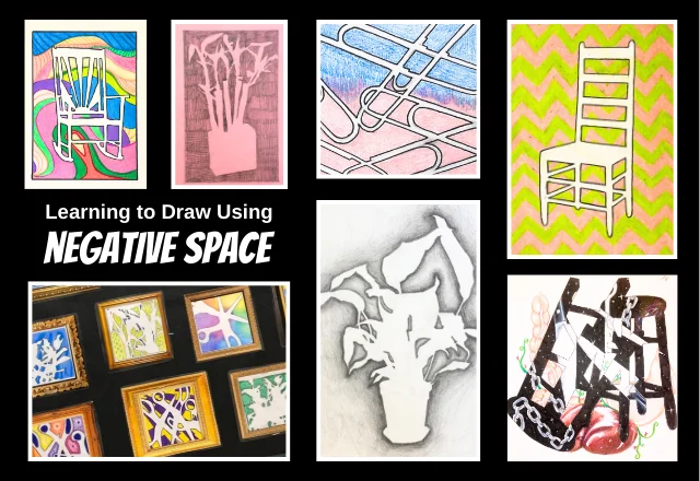
Negative space in art is the unoccupied area around and between the subject of an image. It is just as active as the positive shape: your eye reads both edges. By drawing the background, you improve proportion and simplify composition. This guide covers how to see, plan, and use negative space, with famous examples and a step-by-step exercise.
In this guide
What You Will Make: Seeing the Negative Space as Shape
Negative space is the unoccupied area around and between the subject of a composition: the wall behind a chair, the gap inside a handle, the sky between branches. It also goes by negative shape, ground, or negative volume. Japanese design uses notan for the same balance of dark and light masses. Positive space is the subject itself. The two share every edge, so the background is a shape with a boundary you can draw.
Edgar Rubin's figure-ground study, published in Synsoplevede Figurer (1915), made this visual shift famous: the same contour reads as a vase or as two facing profiles, depending on which side you treat as the object. The Gestalt tradition calls this figure-ground. You are not drawing emptiness; you are drawing a flat jigsaw piece that locks against the chair. That is why figure-ground reading appears across the proportion checks in the perspective guide. Value separates the shapes first, and how color affects space builds on the same separation.
The difference between positive and negative space in art is mechanical: the positive shape is the object, and the negative space is every background shape that touches it. Beginners lock onto positive space in art and treat the background as leftover; the workshop treats it as an active shape. That shift is the skill you will take from the first exercise.
- Negative shape: the flat area that shares an edge with the subject.
- Ground: the field behind the figure in a composition.
- Negative volume: the void around a three-dimensional object.
- Notan: the Japanese term for the balance of light and dark masses; drawing lessons often reduce the exercise to a two-value study.
By the end of the first study, you will be able to point to a background shape and name it as clearly as the chair.
What You Need: A Simple Setup for Your First Study
Set up before you draw. A plain chair against a plain wall gives you one large positive shape and one easily readable background. Keep the arrangement simple; detail makes the negative shapes harder to see. You do not need a camera with perfect exposure; a phone photo is a reference, not a finished print. The arrangement is deliberately plain; a busy background hides the edge you are trying to see.
- A chair with an open back, placed against a smooth wall.
- A grayscale photo of the same setup, to flatten color and value.
- Drawing paper, at least letter size.
- A soft pencil or charcoal, for broad middle tones.
- A cardboard viewfinder with a cut rectangle, to frame the view.
- A timer set for three minutes.
Each tool reduces a decision during the exercise. The photo lets you study the image without moving; the viewfinder crops the scene into a flat design.
Steps: Draw the Negative Space First
Draw the holes before the chair. Train your eye to see the space as a shape before you touch the object. This procedure follows the contour practice Kimon Nicolaïdes described in The Natural Way to Draw (1941). Work slowly; the goal is edge accuracy, not a finished drawing.
- Photograph the chair. Set it against a plain wall, shoot from eye level, and convert the image to grayscale. This removes color and lets value carry the edge.
- Invert the values on a second copy. Reverse lights and darks so the background reads as the first solid shape. The inversion stops you from naming the object too early.
- Block in only the background with one middle value. Cover the wall and floor around the chair with a broad, even tone, and leave the chair blank. You are giving the negative space a printable color, not rendering the scene.
- Draw the holes, not the chair. Trace the spaces between the legs, arms, seat, and wall. Keep the pencil on the area around the object, which is a contour exercise from the core art techniques.
- Add the positive shape lightly. Once the holes look accurate, sketch the chair with a faint line and compare every shared edge. The chair should fit the openings without being forced.
- Make a three-minute study from life. Put the photo down, set the timer, and draw only the negative shapes you can see. The short limit keeps you from drifting back into drawing the chair.
Check the seams before you adjust the object. If a hole is too small, the chair looks swollen; if a hole is too large, the chair looks weak. The background shapes carry the proportion, so correct them first.
Common Mistakes When Reading Negative Space
Most errors come from drawing the object before the background. If the negative shape is wrong, a carefully rendered chair will still sit awkwardly in the room. The goal is not to finish quickly; it is to see the background as a shape.
- Tracing the contour of the object instead of the background. Correction: shade the shape outside the chair first, then check where the chair edge appears.
- Filling the background with a flat, undifferentiated tone. Correction: look for value changes within the background and block those shifts before the chair.
- Treating the space as empty. Correction: treat every gap between the legs and the floor as a shape with a boundary you can copy.
- Ignoring the shared edges. Correction: compare each edge to the same line in the photo; the edge belongs to both shapes.
- Detailing the object before closing the background. Correction: keep the background silhouette complete before adding any chair details.
A flat tone also removes the value shifts that make a shape read as space; how color affects space explains the same relationship in color. If you notice one of these habits, repeat step four once more before moving on.
Variations: Figure-Ground Reversals, Logos, and Paintings
Famous examples make the principle practical. Each one uses negative space as a design element, not as a leftover.
The Vase That Becomes Two Faces
Edgar Rubin's 1915 image, from Synsoplevede Figurer, is the classic test of figure-ground. A central white vase shares its outlines with two black profiles. When the vase is the figure, the faces become the ground; when the faces are the figure, the vase disappears. The lesson is that the edge belongs to both shapes, and the eye chooses which one to hold.
Sky and Water I: Two Systems on One Edge
M. C. Escher's print Sky and Water I lets birds and fish share a single boundary across the sheet. The negative spaces between the dark birds become the light fish, so the two systems trade places without breaking the pattern. Escher works as a modern moment on the art movements timeline; the print also shows why contour drawing and tessellation use the same measuring eye.
The FedEx Wordmark: An Arrow in the Ground
Lindon Leader's FedEx wordmark hides an arrow in the negative space between the E and the x. The mark reads as a simple word at first; once you see the arrow, the ground becomes the message. Leader used the gap between two letters as a shape, not as a pause.
These negative space in art examples share one lesson: the background is a place where information can live. Try a cut-paper notan, a contour drawing, and a collage that mixes found paper shapes; mixed media examples show how to combine several grounds in one composition. If you can move a shape from figure to ground on purpose, you control the image instead of just filling it.

Keep reading